

Marvel Adventures Super Heroes #20, which I posted the solicitation info about yesterday, will be my first cover work work for Marvel Comics, and hopefully not my last, so I thought I'd post a bit of the process that went in to making it today.
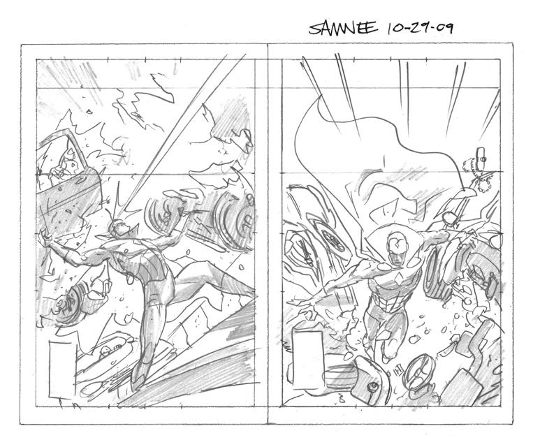
Here is the first pass at a rough layout. My Editor Nate Cosby had asked for a shot of the Vision tearing a car in half. Sounds easy enough, right?
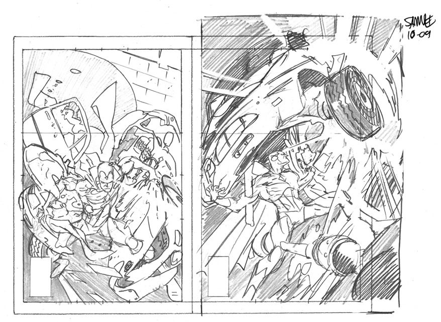
After it was decided that neither of the first two thumbnails were working I took another shot and came up with these two.
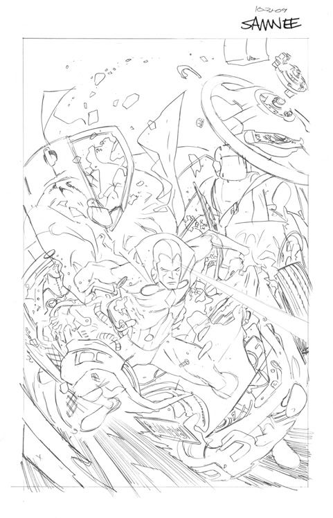
I guess you can tell which one we went with because below are my finished pencils. These are considerably tighter than I generally prefer to work since I wanted this to be JUST right. I even went out and took a bunch of reference photos of my car since I wanted to, though it may not all be 100% correct, make the car parts as believable as possible in each stage.
 And here are the finished inks.
After it was decided that neither of the first two thumbnails were working I took another shot and came up with these two.
I guess you can tell which one we went with because below are my finished pencils. These are considerably tighter than I generally prefer to work since I wanted this to be JUST right. I even went out and took a bunch of reference photos of my car since I wanted to, though it may not all be 100% correct, make the car parts as believable as possible in each stage.
And here are the finished inks.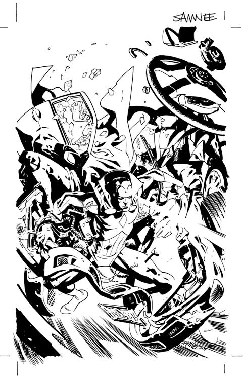
I was a little worried, after taking a step back from the finished piece for a bit, that the Vision's cape could easily be mistaken for the car door, not to mention the amount of confusion that could be caused by the number of times I made the decision to leave lines open, so I worked up this quick little color comp.
Obviously it's crudely simple but it's main purpose was to help separate objects on the page.

All this piece needed now was some killer color work by Veronica Gandini, which you can see at the top of this post, and the final logo and design work.
I was afraid I may had gone a bit overboard on the dramatic lighting here. Vero really made it all work though by using bold colors to help sell the moment, without making it too creepy.
All said, I'm pretty dang happy with how it turned out. And it was a ton of fun to work on to boot!! Be sure to pick up a copy when it hits stands on February 10th. The issue is written by Paul Tobin after all, so I'm sure it'll be a hoot.
4 comments:
I personally love thumbnail #1, something very heroic about the pose. Though the finished one looks quite nice on its own.
For a moment there I thought you were gonna say you went out and *ripped your car in half* then took a photo. That would've been above and beyond. And impossible... ;)
I also really liked thumbnail 1. But I like the final one best as it looks like he's rippin' it from inside out, sorta. Looks meaner
yeah Thumbnail #1 is my favorite too, but they are all great! I have never seen so many cover prelims that all rocked! Thanks for sharing, I love this stuff!
Fantastic cover Chris! I'm hoping you'll get to do more cover work in the future!!
Post a Comment