
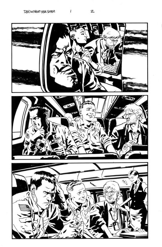
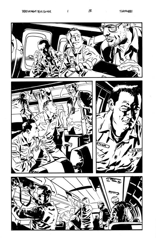
I've been asked a number of times why my published comics work looks so much different than my con/blog sketches, and the answer is pretty simple.
The implied lines I use on my con sketches generally work best in black and white. I'm sure an abundant use of chiaroscuro lighting page after page would drive most colorists mad.
The sketches I post here are all me, from concept to completion. They are usually simple little sketches done for fun, with little to no background, and aren't intended to progress a story in any sort of linear terms.
There may be a few more closed lines here or there in my sequential work, but it's all done to help carry the tone of a particular scene, and insure that what I'm trying to get across in the art is understood by all parties involved. This way they can each make informed decisions in regard to their role in the process without playing a guessing game every time I decide to leave something out. At the end of the day comics are a team effort, after all.
Hope that helped to clear things up a bit.
That said, I couldn't be happier with the look of the book. VC's Joe Caramagna has been doing a great job on the lettering, and June Chung's colors choices have just been terrific. I honestly can't say enough nice things about the team on this book.
Check out the six page preview here to get a look at the finished versions inked pages you see above. Or head out to your local comic shop to pick up a copy or ten of Dead of Night: Devil Slayer #1 and read the whole kit and caboodle.
2 comments:
Dig it. I absolutely love the artwork and cannot wait to get this after work today. You going to be at the Mo-Kan Comics Conspiracy?
Makes sense. Lovely pages.
Post a Comment