Tuesday, September 30, 2008

Super Tuesday: Crossfire


Now that Image is putting out the 452 page DNAGENTS: INDUSTRIAL STRENGTH EDITION trade paperback, here's hoping we'll also see a big collection of Mark Evanier and Dan Spiegel's Crossfire one day. Originally published by Eclipse back in the '80s, Crossfire was a really great comic. If you happen to come across any copies do yourself a favor and pick up a few. Oh, and it goes without saying that I'll be picking myself up a copy of the DNAgents trade:)

This piece had a mind of it's own! It started out as just the image of Crossfire jumping with a flat black background but i quickly realized that his arms sort of disappeared in all that ink. I decided to add the moon to make his left arm pop, but it still didn't feel quite right. Frustrated I shook up my white out pen and set to work... and half an hour later, we have buildings, lights, trees, the Hollywood sign and our hero tight-rope walking an electric line. Now I remember why I try not to use white-out!!

Monday, September 29, 2008

Monday, September 22, 2008

Devil Slayer: One page's journey...

Just so we don't all get burned out on the daily sketches, here's a little peek behind the curtain a bit with how I go about drawing a comic page.
First I get the script (not shown here) and read though the whole thing twice.  Doing this helps me to get an idea of where we're going with the story.  It also gives me a chance to get a lot of the visuals rattling around in my head.
On the second read through I'll often make little notes to self and crude little stick figures in the margins to refer back to, in case I have a particularly inspired angle or pose, when I start thumbnails.
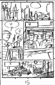
Now's time to finally put pencil to paper!   Thumbnail sketches are tiny, tiny versions of the comic page drawn to give the editors an idea of where I plan to go with the art. Here's the thumbnail for Devil Slayer#1 page 15 shown a bit larger than actual size.

I try to do thumbnails for an entire issue (generally 22 pages) all on the same day to make sure we have a good flow from page to page.
After the thumbails are approved I rule out my panel borders and go straight to pencils. 
I used to draw full size 11x17 "roughs" in marker that I would then trace on a lightbox.  I ended up cutting out the rough stage altogether since at the end of the day it just ended up eating too much time. Not to mention the fact that by the time a page was completed from thumbnail to inks I had already drawn it FIVE times!
Here's the first draft of the pencils for page 15.  Drawn first with a hard lead and tightened up (but not too much) with a mechanical pencil with a softer lead.

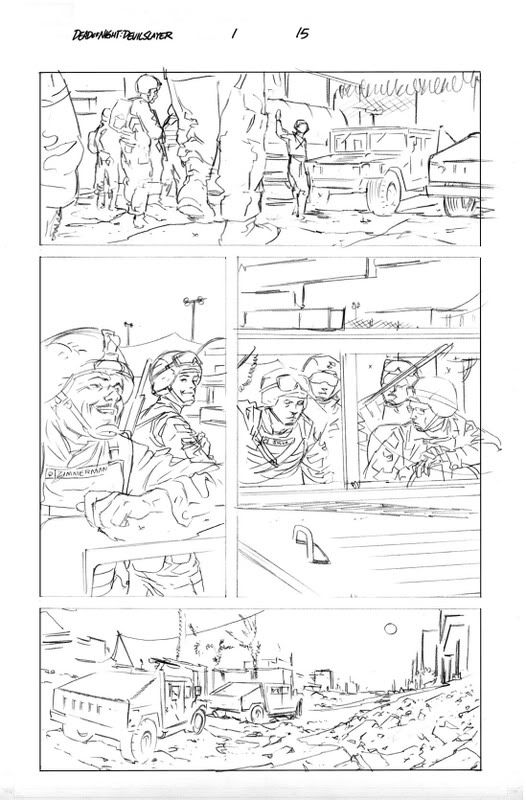
It was decided that the angle in panel 1 wasn't quite working. We needed to have a better look at the main character here, so he was brought up to the foreground in this version.  Bit of a dutch angle too, since things are about to get weird.  If you haven't picked up the issue I won't spoil it for ya:)
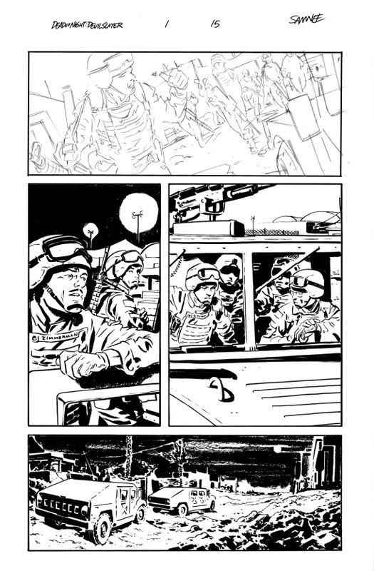
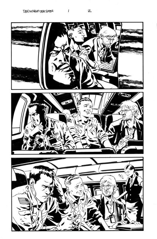
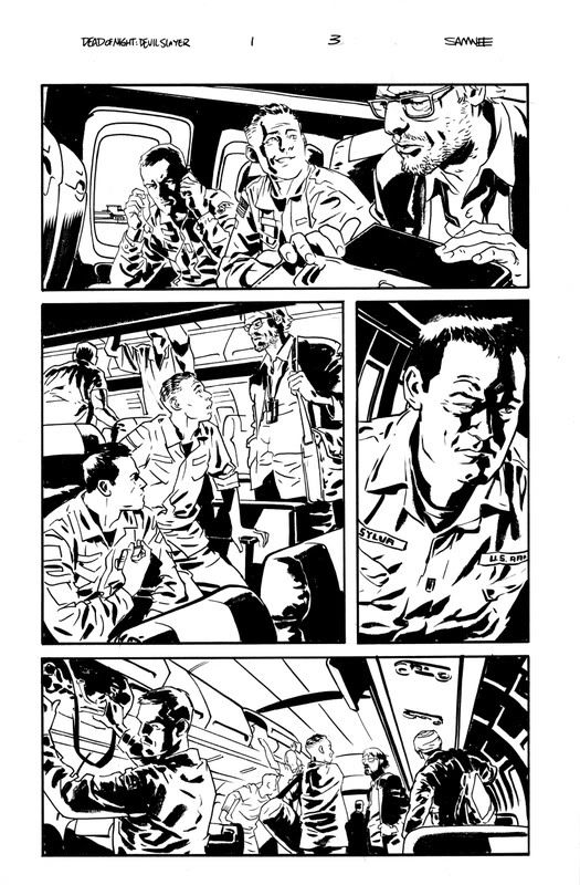
After the new version of panel one got the thumbs up I went ahead and finished off the inks for the page.  The inks were done with a Raphael series 8404 size 4 brush, Pentel Color Brush, Faber Castell Pitt Pen sizes B and M for panel borders.  Oh, and a few bits of grease pencil as well. 
And here we have the finished page.

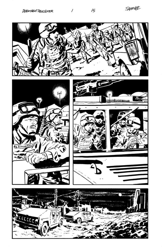
I ended up tweaking a few more things before this got uploaded to the Marvel FTP site, but this is pretty close to the file that was passed along to be colored and lettered.

Friday, September 19, 2008

Gal Friday: Wendy (and Marvin)


As of Teen Titans #62 (and since we all know death is forever in comics) RIP Wendy and Marvin.

Thursday, September 18, 2008

Things You Need Thursday


AMERICAN SPLENDOR: ANOTHER DOLLAR TP
Written by Harvey PekarCover by Dean Haspiel
Art by Darwyn Cooke, David Lapham, Chris Weston, Dean Haspiel, Ty Templeton, Darick Robertson and others*
More moving moments from the life of the essential everyman! Harvey Pekar returns with the second Vertigo volume of his AMERICAN SPLENDOR series. Harvey moves into his senior years and finds that he may be able to cope after all.
Advance-solicited;
on sale January 7 • 136 pg, FC, $14.99 US
MATURE READERS
*I'm one of the "others".  Not like the Others on Lost, but an "other" just the same.


DEAD OF NIGHT FEATURING DEVIL-SLAYER #4 (of 4)
Written by BRIAN KEENE
Art by CHRIS SAMNEE
Cover by KAARE ANDREWS
Its a final showdown in the Garden of Eden as the Devil-Slayer faces off against both demons and angels in an effort to stop Armageddon! Everything is at stake if he doesn't defeat the demon Belathauzer, the archangel Gabriel, the Bloodstone Group and the other Operation: Xenogenesis conspirators in time...in the terrifying conclusion to this much-talked-about reimagining, written by award-winning horror novelist Brian Keene (Ghost Walk, The Rising) and illustrated by Chris Samnee (DAREDEVIL: BLOOD OF THE TARANTULA)!
32 PGS./Cardstock Cover/Explicit Content ...$3.99

Wednesday, September 17, 2008

Whatever Wednesday: Shadow


Sure I posted a Shadow sketch just a week or so ago, but I've been having such a great time listening to the old Shadow radio shows I couldn't help but do another one.

Tuesday, September 16, 2008

Super Tuesday: Silver Surfer

Just the other day I was re-reading Silver Surfer: Parable.  This amazing two issue story was drawn by Moebius back in the '80s and still floors me every time I  crack it open.  
After soaking in this crazy yarn I decided to take another stab at ol' Norrin Radd.  I'll never live up to Jean Giraud aka Moebius's interpretation, but I'm actually pretty happy with how this turned out.

Monday, September 15, 2008

Monster Monday: the Master (and Buffy)


I generally listen to music, podcasts or TV shows while I work.  It helps to have some background noise that isn't the cat now and then.  Today I'm starting all seven seasons of Buffy the Vampire Slayer again.  So in honor of that, today we have the "big bad" of season one, the Master.
Buffy is another one of those shows that Laura introduced me to when we first got together.  I can't imagine how boring my work day would be without the shows that she turned me on to like Buffy or Futurama.  
Thanks, Lulu.

Friday, September 12, 2008

Gal Friday: Closer

These last couple of Gal Fridays drawn from photos have been a lot of fun, so here's one more:) This time it's from an ad promoting the Natalie Portman film, Closer.
I was trying for more of a  Jorge Zaffino feel with this one.  He somehow always managed to get all the details needed across in his work without making anything seem too clean and polished in the inks.

Thursday, September 11, 2008

Technicolor Thursday: Nightwing


This sketch was inspired by the new set of DC Superheroes Laura bought for me a couple weeks back. These are a really cool toys to have decorating my "office".  Office is in quotes since it looks more like a nerdy 10 year old's bedroom rather than a work space, it just happens to have a drawing desk in the place of a race car bed.  We got the entire set so I could get the build a figure Solomon Grundy:)  These are super great for sitting up in my nerdy little room, but if you're getting 'em for your kids don't expect them to stand up to too much play.  For some reason their joints are made with a cheap rubber, instead of the plastic used on the rest of the figure.  I'm still planning on getting whatever sets come out next... just wanted to give you a heads up.

This scan isn't exactly what the original looks like, but I think it works.  Maybe I should explain... Last week we switched from a PC to a Mac so I've had a bit of a learning curve moving over from a mix of Adobe Photodeluxe and an old version of Photoshop to solely Photoshop CS3.
I'll get the hang of it though.  I have a book and everything:)

Wednesday, September 10, 2008

Whatever Wednesday: Batman


Yeah, it's another brooding Batman.  Technically this should go in Super Tuesday, but whatever.

Tuesday, September 09, 2008

Monday, September 08, 2008

Monster Monday: Evil Dead


Here's Cheryl from Evil Dead.  I dunno what else to say... Hope nobody else out there is having a case of the Mondays.

Friday, September 05, 2008

Mid-Ohio Con: Sketch List

I'll be attending the 2008 Mid-Ohio Con on October 4-5 and wanted to give you blog followers a chance to get in on early requests for con sketches.  
My prices for con sketches this go 'round are:

$50 for a single character in B&W on 9 x 12 bristol
$75 for two characters (on 1 page) in B&W on 9 x 12 bristol

All sketches will be personalized, no exceptions.  If you'd prefer something drawn in your sketchbook I can put your name on the list, but this list is primarily for sketches that I can get done before the show.
If you know you will be attending Mid-Ohio con and would like a sketch please drop me a line, my email address in my profile.
If able I will try to have your sketch done before the show, otherwise each sketch will be drawn at the show in the order I receive your emails.
I will most likely only be taking on about 10 sketches each day at the show so I can make each one as good as possible. Hopefully getting on the list will ensure that anyone who'd like a sketch can get one, and this way there's less wait for all you nice folks.

Gal Friday: Armani


Here is another sketch, along the same lines as last week's Gal Friday, drawn from a photo that's been in my files for a few years now. This one was actually an old add for Georgio Armani.

Thursday, September 04, 2008

Devil Slayer: on stands today


I've been asked a number of times why my published comics work looks so much different than my con/blog sketches, and the answer is pretty simple.
The implied lines I use on my con sketches generally work best in black and white. I'm sure an abundant use of chiaroscuro lighting page after page would drive most colorists mad.
The sketches I post here are all me, from concept to completion. They are usually simple little sketches done for fun, with little to no background, and aren't intended to progress a story in any sort of linear terms. 
There may be a few more closed lines here or there in my sequential work, but it's all done to help carry the tone of a particular scene, and insure that what I'm trying to get across in the art is understood by all parties involved. This way they can each make informed decisions in regard to their role in the process without playing a guessing game every time I decide to leave something out.  At the end of the day comics are a team effort, after all.
Hope that helped to clear things up a bit.
That said, I couldn't be happier with the look of the book.  VC's Joe Caramagna has been doing a great job on the lettering, and June Chung's colors choices have just been terrific.  I honestly can't say enough nice things about the team on this book.  
Check out the six page preview here to get a look at the finished versions inked pages you see above.  Or head out to your local comic shop to pick up a copy or ten of Dead of Night: Devil Slayer #1  and read the whole kit and caboodle.

Technicolor Thursday: Green Lantern


Here's a shot of Hal Jordan putting that old "if they're too powerful, punch 'em in to space" rule a lot of superheroes follow.

Wednesday, September 03, 2008

Whatever Wednesday: Marvel Demons


I've been drawing quite a few demons in Devil Slayer (and plan on a lot more in issues to come) so I decided to break out the old Official Handbook of the Marvel Universe and take a crack at a few of the established Marvel demons. I don't know if I'll be able to draw any of these crazy lookin' things in the upcoming issues or not, but this was quite a bit of fun so... whatever.

Oh, and there's a six page preview of Dead of Night Devil Slayer #1, which hits stands tomorrow, over at CBR.

Tuesday, September 02, 2008

Super Tuesday


It had to happen, right? Superman for Super Tuesday? I've got it out of my system now though, so I'll be sure to have a bit more varied assortment of the super folks in the future:)

In a strange coincidence I just got this link to Ordinary People Change the World. Com in my email this morning, concerning the current state of the home where Superman was created. Thousands of people go to Metropolis, Illinois every year, but isn't it about time that Jerry Siegel's home, the true birthplace of Superman, was considered a landmark?

Be sure to go to the link above to bid on an item, pick yourself up a snazzy shirt or donate to the Siegel and Shuster Society.

Monday, September 01, 2008

Monster Monday: Killer Croc


Hmm. Now that I think about it Croc isn't really a monster at all.  In the past ten years or so he's been drawn like one, but he's really just a big ugly guy with a bad skin condition and sharp little teeth.
Maybe I should've stuck with the movie monster motif I started for Monday sketches:P